Take A Seat: Understanding The Modern Chair
Philadelphia Museum Of Art
2600 Benjamin Franklin Pkwy.
Philadelphia
July 7, 2024
A good chair is hard to find. I spend my days on Facebook Marketplace in search of the right seat: one that will serve my posture, preserve my pockets and protect my sense of feng shui.
But I’ve never found the right fit. In between longing for love seats that make it up my apartment’s narrow staircase and mid-century modern lounges that could cater to any house guest, I took a break from online bartering to go window shopping … inside the Philadelphia Museum of Art.
Toward the far back of the massive museum building are stacks of designer stools, couches and ottomans. They’re all part of the ongoing exhibit: “Take a Seat: Understanding the Modern Chair.”
Let’s be clear: I was at the museum because the first Sunday of every month means free admission. Not because I was considering taking out a loan to buy a chair. But the show is an interesting attempt to make the chair, an object ubiquitous to the point of mundanity, accessible to the public even in its most highfalutin’ form.
To me, walking around the display was like traipsing through wonderland. For context, my personal role model is a former next-door neighbor whose hobby was, and I pray still is, hoarding chairs. Her roommates were not supportive of the habit, nor of her entertainment of two boyfriends who didn’t know the other existed or her chain smoking on the building’s balcony. But I always felt that she had chosen the correct commodity — one that straddles the border of beauty and function — to collect in lieu of honest human commitment.
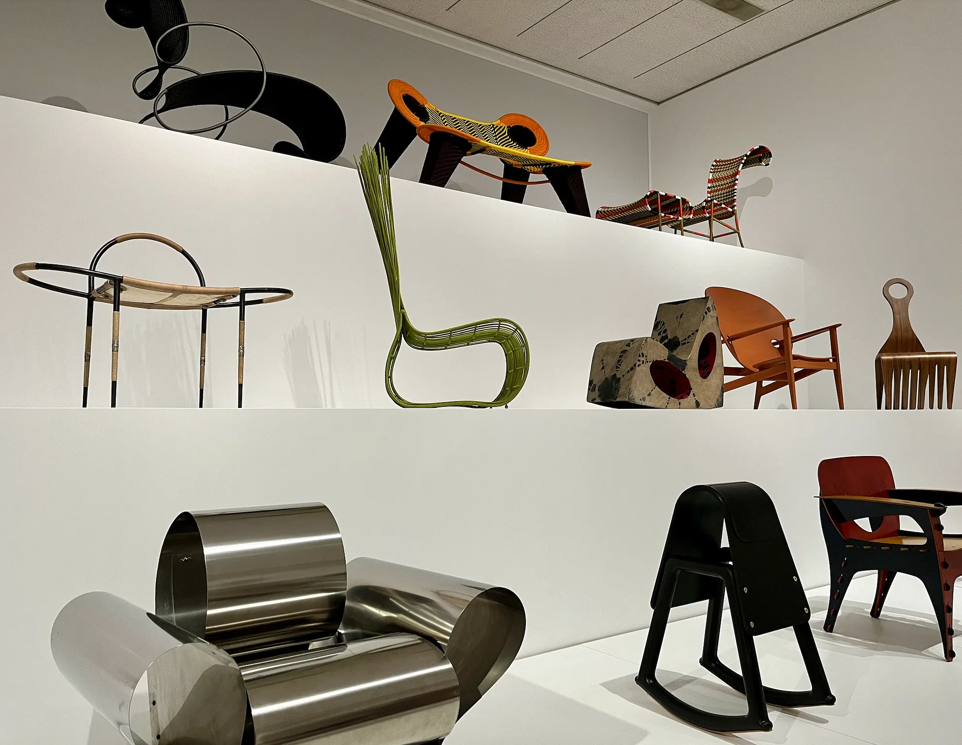
She was with me in spirit as I stood for what felt like hours in just one room of the museum, staring at all kinds of materials — wood, steel, foam, paper byproducts — sculpted into curiously curvaceous, and sometimes rigidly simplistic, seats that basically begged the viewer to test the waters. Alas, we were all mere viewers, barred by security from climbing into the most durably designed chairs in the world lest we leave an impression on a cushion.
I was forced to rely on my brain instead of my butt as I read about the design thinking behind each piece. There was Norman Teague’s 2015 “Sinmi” stool, a small, black saddle-looking hump, inspired by the informal ways that people position themselves when “chilling.” Its name comes from the West African Yoruba language, in which “Sinmi” means “to relax.”
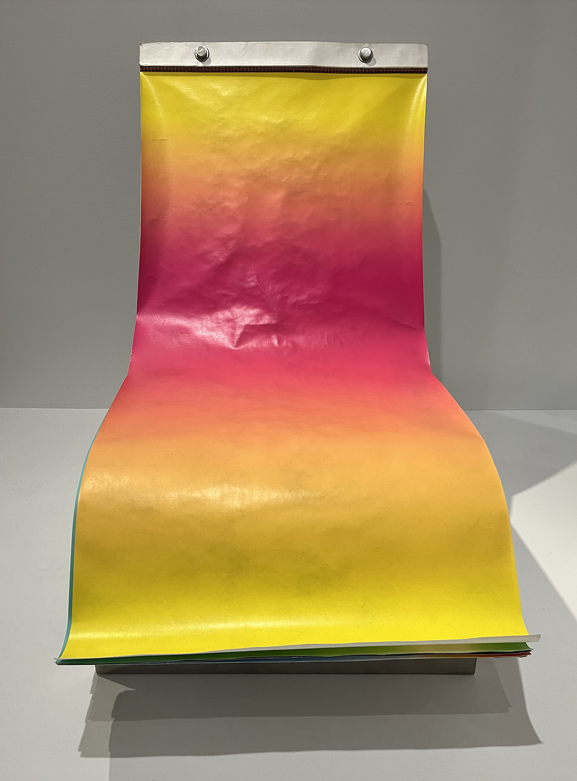
The “Darwin Chair,” crafted by Austrian designer Stefan Sagmeister in 2010, is a lounge chair covered in 200 sheets of paper printed with different patterns and colors that, all seen together, allegedly “tell the story of the creation of the universe.” The interactive design allows sitters to flip over or rip off the cover like one piece in a giant pad of paper — providing a new look once the old gets tired or dirty. I don’t really know what the story of the universe is, let alone what it looks like, but the pink ombré slip seen on the chair last Sunday stood on its own, regardless.
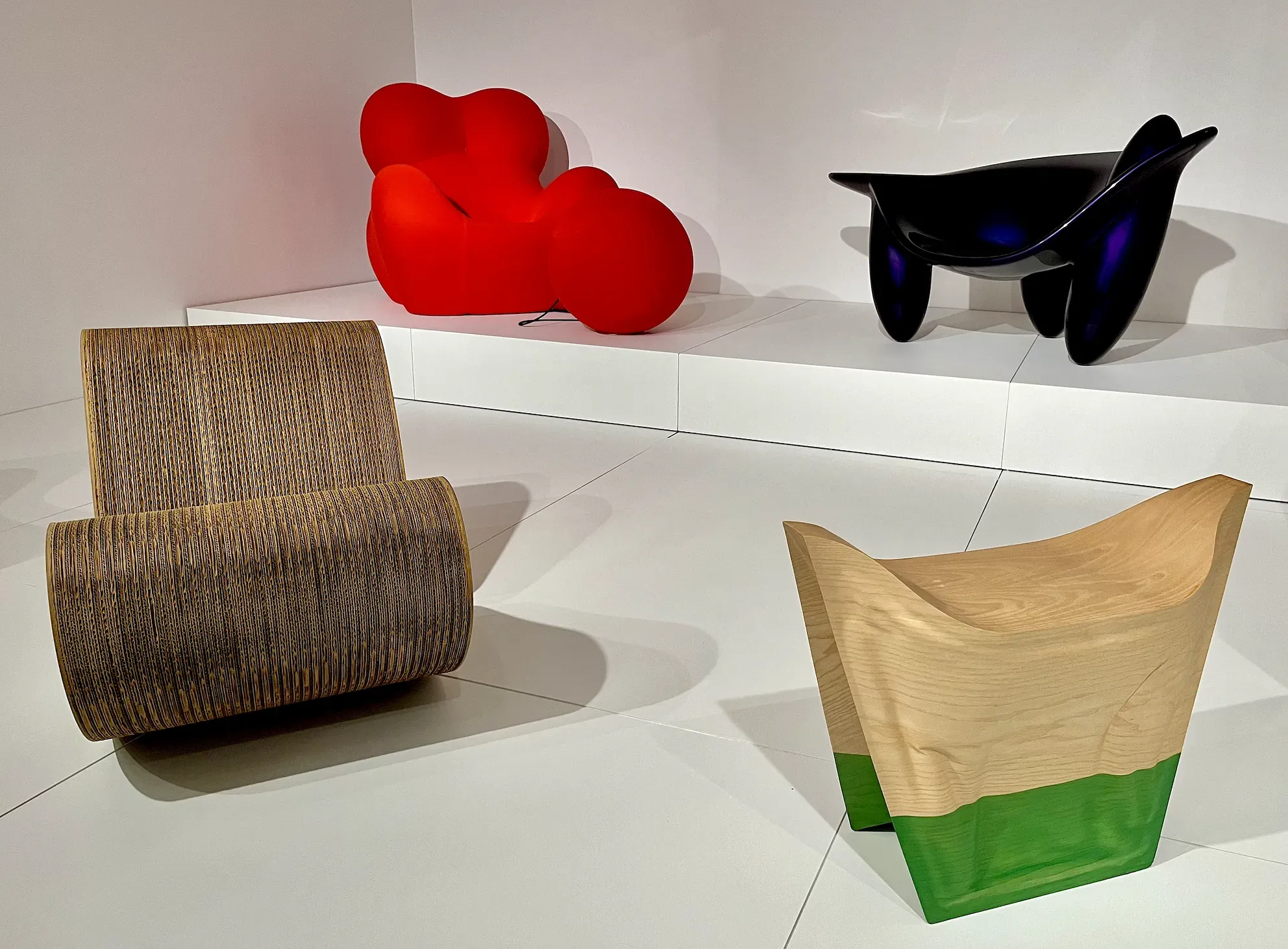
The “Up 5” chair and “Up 6” ottoman, designed in 1969 by Gaetano Pesce, is a similarly loaded idea. Constructed out of an expandable foam material newly developed that decade, the seat is “based on his observation that a shower sponge regains its shape after being wrung out,” according to a note from the curators. The massive red chair could compress during transport and then grow back to its original shape and size once unwrapped, no doubt a sign of the time’s growing obsession with consumer convenience. But get this: The chair, in all its bulbous glory, was “intended to resemble a prehistoric female fertility figure,” who I assume must be the callipygous Venus of Willendorf, “with a ball and chain attached to symbolize how women can be confined in a male-dominated society.”
I was developing a compulsion for the degree of detail set forth by the designers. Were these chairs marks of genius, or just obsessive overthinking? I had to take a step back from my front row stance: Wasn’t my role as a museum patron, after all, to “understand the modern chair” at large?
The omnipresence of chairs in the world of high design — as chronicled in popular culture by the likes of Fred Armisen and Maya Rudolph through SNL’s recurring “Art Dealers” sketch — seems somewhat self-evident. I’d argue the chair is an easy lesson in design. It can teach and test creators’ sense of style in addition to their understanding of material, structure and durability.
Famed furniture designer George Nelson even argued that “every truly original idea — every innovation in design, every new application of materials, every technical invention for furniture — seems to find its most important expression in a chair.”
I turned to Reddit for some further reflections on the phenomenon. User “AdministrationLimp71,” like most others debating the subject within the R/Design thread, reasoned that it’s about universality. Maybe designers draft chairs the way painters reproduce fruit bowls: “Every single human being knows how an apple looks and every single butt knows what a proper chair feels like.”
Here’s what the hyperbolism of both AdministrationLimp and George Nelson might tell us, albeit in a backwards fashion: The rising recognition of the chair as a competitive design challenge has actually taken on a life of its own. The designers featured at PMA grasped onto the field’s infatuation with this particular piece of furniture and have exploited “the chair” to make a name for themselves. In other words, creating iconic chairs is often the first way that designers are able to sell their schtick / sincere artist statements to an audience of critics.
Here’s an example: British-Israeli industrial artist and architect Ron Arad’s breakthrough began with the Rover chair, which refashioned the leather seats of Rover P6 cars onto steel frames. That chair has, in turn, symbolized the development of his long career exploring fashion, technology and luxury. Another design he’s done since then includes a chandelier commissioned by the Swarovski crystal company that can spell out text messages sent to a dedicated phone number through LEDs. While the Rover is not on display at PMA, Arad’s equally famous “Well Tempered” chair is. That chair’s made of just four pieces of sheet steel folded like paper to create a uniquely springy seat.
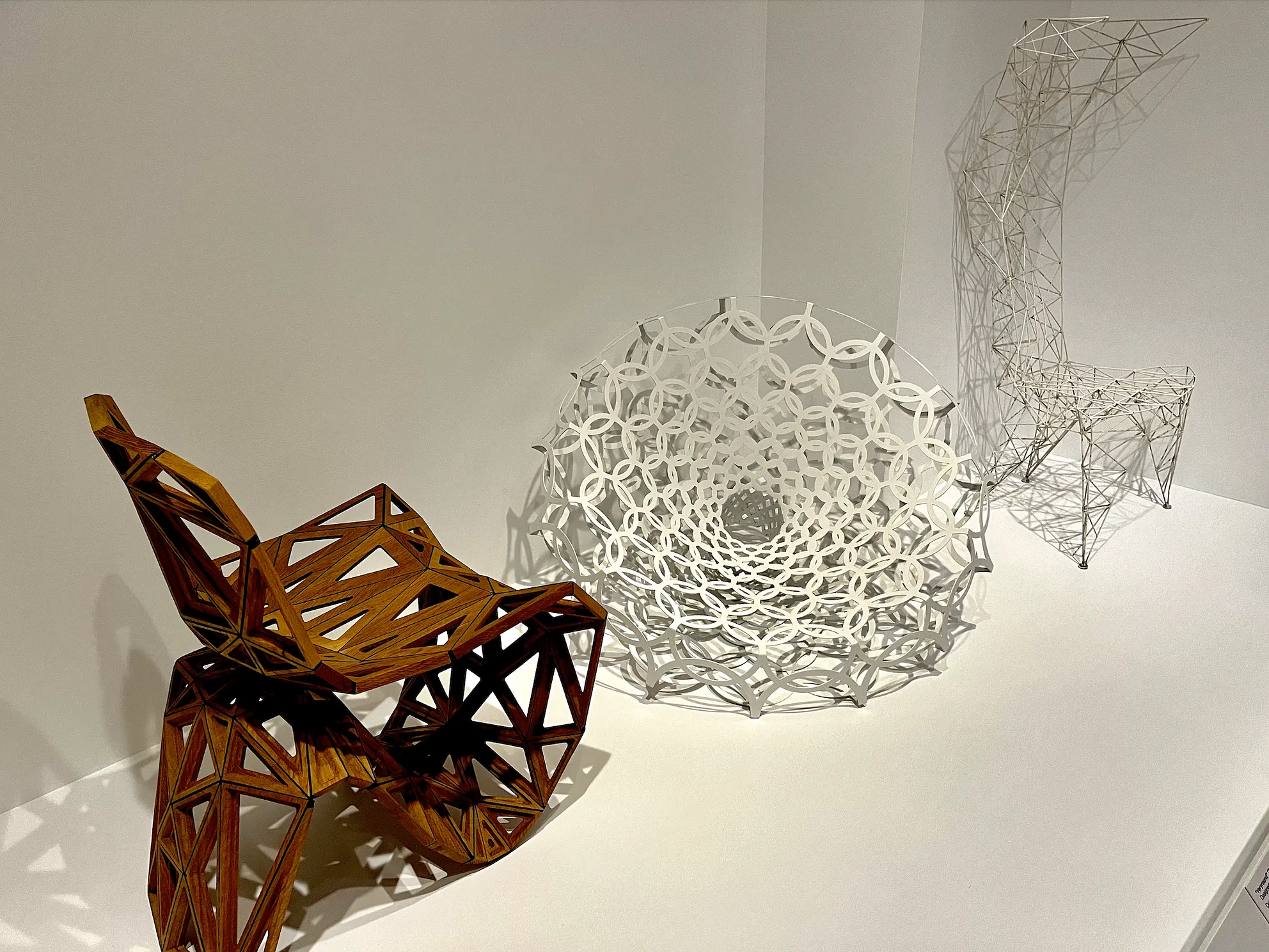
From reused clothes to fishing lines to laser cut wood, the materials warped into chairs as seen at PMA represent artistic breakthroughs and foreshadow the narratives of successful careers. The chair doesn’t have to be comfortable — it has to say something meaningful, whether that’s about culture, climate change, or technological innovation.
But by following that formula, designers are, incidentally or not, taking a purportedly fundamental public good — an amenity we demand in our public parks and street corners — and making it increasingly inaccessible.
I guess that’s kind of the definition of “designer” anyway. But it’s definitely not the definition of design.
Here’s the tension: The internet tells me the chair was basically born out of stratification 5,000 years ago. Arm rests, back support, and height were all developed for the wealthy, either as tokens of comfort or as literal power pedestals (I’m thinking throne). There are plenty of cultures that have opted to sit flat on floor mats rather than conform to the right-angled structure of traditional chairs. Though mass-produced chairs are now everywhere, it’s not as though they’re actually universal. (Looking at you again, AmbitionLimp!)
The New York Times loves to talk about how it’s not just sedentary lifestyles that are hurting us. We’ve supposedly been spending our whole lives sitting in chairs that are totally ill-designed for our bodies. Not only that, we’ve often been forced to stay seated in those chairs, for example, through eight-hour school days spanning our entire childhoods. And yet the rebellion seems to be making its way into our lives through standing desks and yoga balls.
The fact that we collectively conceptualize the chair as a “universal” experience is a deep problem for people who lie outside of what powerful societies have deemed normative within the realm of human identity, from senior citizens to neurodiverse kids. One example that comes to mind is the way fat people are often made to feel small for not fitting into seats they paid for themselves. I’ve had friends buy extra airline tickets or avoid flying altogether because planes simply don’t accommodate their bodies.
Specification is too often frowned upon as emblematic of abnormality while customization remains coveted. Even as a kid, I remember my music teachers pointing to an extra-wide chair in a concert hall as proof that William Howard Taft had, during his presidency, frequented the space. The adults were trying to impress us, to instill some kind of feeling of pride and power amid a ghostly presidential presence. The personalized seat, amid rows and rows of smaller ones, suggested specialness, but our teachers were simultaneously poking fun at his size to get an easy laugh from a class full of kids.
If we looked at that custom seat as a specification rather than personalization, maybe we could just have bigger seats all around. That sounds nice!
Disability designer Sara Hendren has done a lot of work explaining the true logic of universalism to the public. As she explains in one article for The Guardian, “The logic of universalism goes like this: designers gain surprising and powerful insights from looking closely not at norms and averages – not at people whose experiences fall well inside the expected middle of a curve – but instead at people and scenarios at the margins of experience, so-called extreme users. Good designers, the thinking goes, will take a close look at unusual circumstances, places where products (or environments, or services) are full of friction for people with particular needs. There, in the margins of human experience, are clues to suboptimal conditions that may also affect people in the normative middle, though perhaps to a lesser degree.”
Let’s also return to our earlier observation: Chairs are cool because they force designers to think about function just as much as ornamentation.
It was surprising to me that not one of the chairs on display at PMA seemed directly concerned with the question of function. None of them looked comfortable enough to sit on for more than a few minutes at a time. I laughed at the rare attempts by curators to weigh in on the comfortability of the chairs on display; A plaque describing Oki Sato’s “Cabbage Chair,” made of otherwise unwanted paper byproducts created during the manufacturing of pleated fabrics for the fashion industry, is “surprisingly soft and comfortable due to the elasticity of the folds in the paper… despite its rough appearance.” We’ll have to trust the curators, because that peeled-back bean bag is too fancy for the rest of us Philly plebeians.
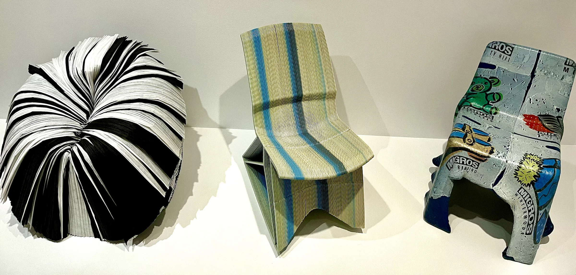
The exhibit included several designer chairs whose “functions” seemed to be raising awareness about or combatting climate change. But a German chair made from recycled plastic grocery bags isn’t gonna do that. I don’t think any of us would put that expectation on a chair. But it might be a problem if the recycled plastic grocery bags created a chair too uncomfortable to sit on. I repeat: we were not allowed to sit on the chairs. But one particular chair that was made by out of recycled plastic bags looked really German and really uncomfortable.
A stronger example of specification meeting function in a dynamic way is The Iklwa Chair. Named after a short stabbing spear used by the Zulu people of South Africa during the 1800s and shaped and colored to recall a Zulu shield, spears and “clay tones of sub-Saharan African soil,” as the curators put it, the 2018 chair has launched designer Mac Collins into a still early career of translating his Afro-Carribean roots through modern art.
Aesthetic specification can be a beautiful tool to both popularize and affirm untold histories. But while I salivated over the genius design capacities of visionaries across the world, so aptly able to transform a chair into a tool of self-expression, I found myself increasingly fixated on the question of how our future will fold itself into our chairs.
Returning briefly to Ron Arad, one of my favorite chairs on display was, ironically enough, an overt ode to high fashion. Arad developed a seat shaped like a figure eight, with a woven vest cover created by Issey Miyake. The concept is inspired by the human habit of shedding a layer of clothing onto a chair upon walking through the door. And the vest itself functions as wearable upholstery that can be removed from the chair and worn right back out the door. It’s not the most noble idea, but it’s smart, full-circle art.
Ultimately, the story of the modern chair, at least as told by PMA through a small collection of designers, shows how universality and specificity are two sides of the same coin. But I wonder where chairs are headed down the line. From office spaces to classrooms to subways, can we use what we know now to create seating that will serve us, both as individuals and communities, rather than continuing to harm us?
The exhibit in some ways shows us the way forward, illustrating specified design as expansive territory for genius thinkers. As the Ron Arads of our world grow old, might there be more seats at the drawing board for designers to dream up something more beautiful than name branding? Or is the notion of luxury already too embedded in our brains and our butts, infinity signs and all? As we’re forced to find ourselves in an ever-changing world, will the chair change with us?
I am ready for a new day to dawn on the modern chair. And when it does, maybe I’ll even reap the trickle-down benefits in a real marketplace — instead of on Facebook.
NEXT:
“Understanding the Modern Seat” remains on display through Oct. 20. Get more info on the show here.
