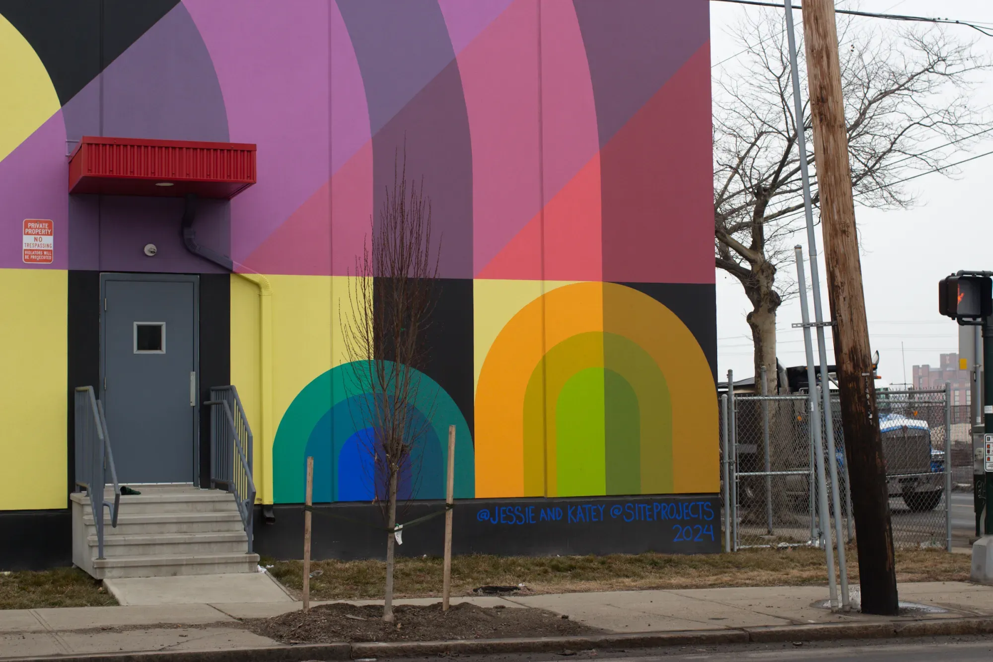
Blue Moon Chapel
By Jessie and Katey
Corner Chapel and East
On view 24/7
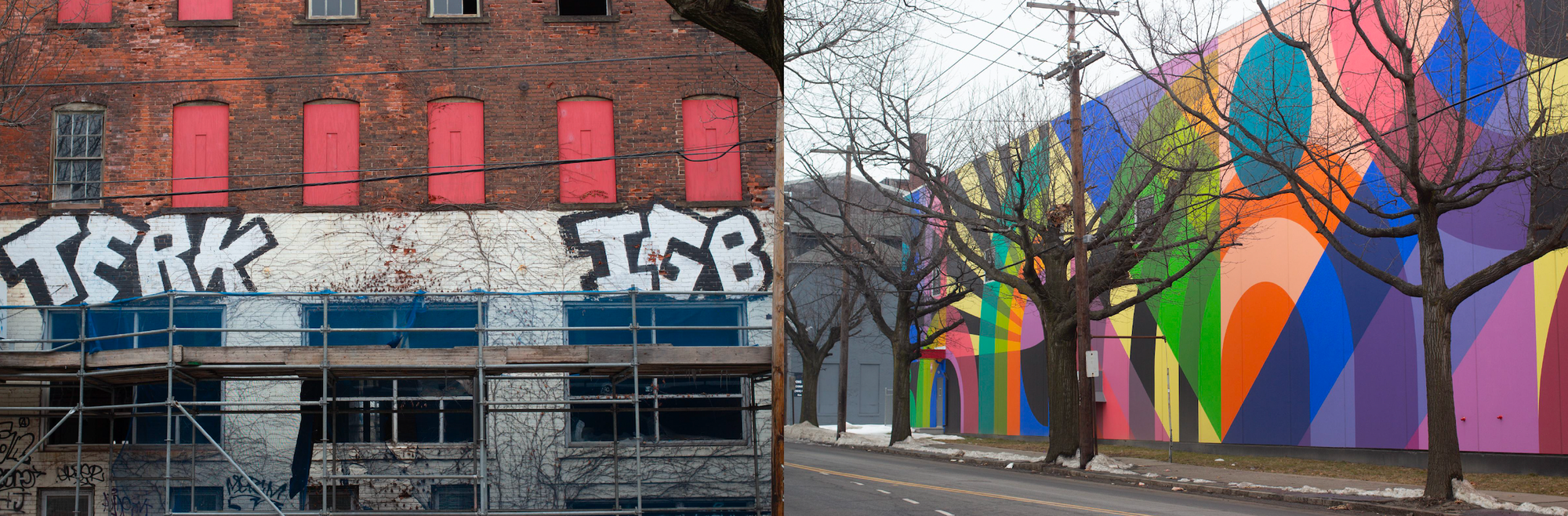
Untitled
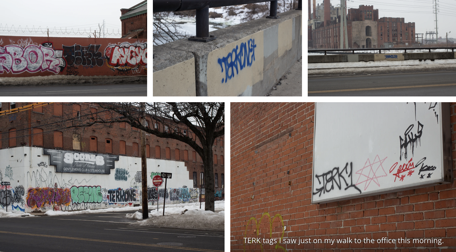
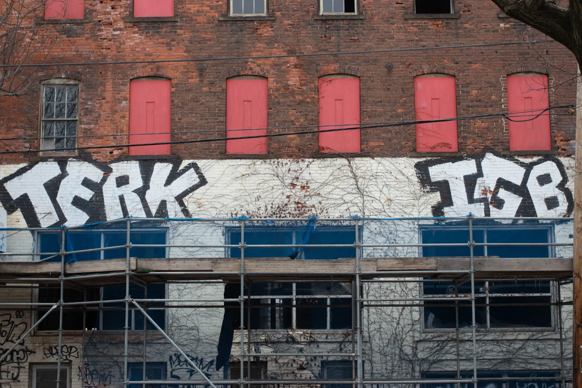
By “TERK”
Chapel Street between Hamilton and Wallace
On view 24/7 until…the building gets torn down?
Walk down Chapel Street from Hamilton Street to East Street at the edge of the evolving post-industrial “Mill River” edge of Wooster Square, and you’ll see two major works of art side by side. One throws a vision of vibrance on the between-neighborhoods industrial section on the Mill River. The other is behind a skeleton of long-neglected scaffolding, under a row of closed-off windows whose solid barriers now look like doors that would open into the empty air.
The first has a name: Blue Moon Chapel. It’s a mural painted on a warehouse, commissioned by public art nonprofit Site Projects. The other has no name that I know of. It’s a collection of graffiti with a familiar New Haven tag: TERK.
New Haven has plenty of both kinds of art in the city. Here, in this Twilight-zone-esque area of large buildings and few windows, the two can exist as next-door neighbors. One feels natural to the landscape, evidence of the human spirit, the other grafted on as an effort to increase the dollar value of buildings in a neighborhood.
I always suspected the artist behind prolific New Haven graffiti tag TERK (sometimes TERKONE) was a rebel with a cause. It’s a hard hunch to prove for a style of art so allergic to self-explanation.
TERK’s tags on bus stops, building exteriors, and highway underpasses from Fair Haven to Westville often just say one word—well, TERK.
Their tag on the side of the abandoned building on Chapel Street adds another piece to the puzzle.
There, along with the classic TERK tag, is the acronym IGB in the same font. Those who are familiar with suicide prevention efforts might recognize these three letters as a shorter way to say the phrase “It Gets Better.” I can’t confirm that’s what TERK meant. For all I know, IGB stands for Install Green Buses or Inflated Gas Bill. But beauty is, famously, in the eye of the beholder, and I’ve got my eye on TERK.
So here’s what I’m beholding: a small bone to throw at TERK’s oft-mystified audience, a clue as to what the artist believes in. Their passion is clear—what else would drive a person to make version after version of large-scale, uncommissioned public art? But passion for what?
Answers, for graffiti fans, are few and far between. A hint in the form of an acronym is plenty to chew on. Perhaps TERK, like many of us, has been touched by the great demons of hopelessness and depression, and stuck around long enough to see that there is something on other side.
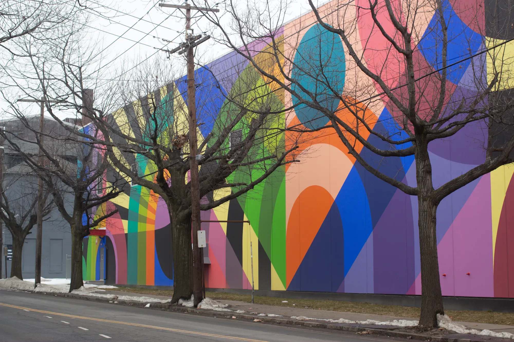
Just a few steps down the street is the official mural. When I saw the painters at work back in fall 2024, I was surprised. The design they were creating was huge, and somehow I hadn’t heard anything about it. And who was that on the lift? Could it be Kwadwo Adae, Michael DeAngelo, or any other New Haven legends I had come to expect to wield the extra-large brush?
No; it was a cheery team from Baltimore known as Jessie and Katey (full names Jessie Unterhalter and Katey Truhn), commissioned by the nonprofit organization Site Projects, which was invited into the project by the city.
I tried to like the mural. I really did. I passed by it every day coming home from work, trying each time to notice something new about it. It was bright and whimsical against the semi-neglected salt piles looming over the Eastern landscape. I could make meaning out of that, maybe. But the art seemed to exist in a world separate from its surroundings.
Site Projects described the art as inspired by Josef and Anni Albers, abstract artists who came to New Haven when Josef became the head of design at Yale, and Sol LeWitt, a Connecticut (and then worldwide) artist known for unique geometric installations in the form of instructions that are carried out by others. The reasoning is compelling, especially when I think about Josef Albers’ most famous series, Homage to the Square, which places same-shaped, differently-sized squares of different hues inside each other. Or the sprawling, vibrant Sol LeWitt piece taking over a staircase of the Wadsworth Atheneum in Hartford.
But when I scrolled through pictures of Unterhalter’s and Truhn’s body of work trying to find the Chapel Street piece, I couldn’t pick out which one was the New Haven one. I would be convinced I’d finally found it, only to see it was a different mural in Atlanta or Philadelphia. (The New Haven mural actually isn’t on their website at the time of writing this.)
TERK doesn’t need to tell me why they’re relevant to New Haven. I just need to look around the corner, and there they are. Each new tag adds to an existing web, constructed over time.
In our own publication’s reporting of the Site Projects mural, executive director Laura Clarke is quoted as saying, “In the 15 to 20 years this mural will last, a lot of the buildings around here will be turned into apartments,” followed with, “Just think what it will do to activate this neighborhood.”
In a different article of ours, about a Westville “eyesore,” graffiti tags are presented in a city hall meeting as examples of the blight that has accumulated on a neglected property.
How can one piece of art add value to a neighborhood, while another is proof of a building’s dwindling value? I have worked on murals and enjoyed the magic of seeing one while walking down the street. I have also grown uneasy looking at building listings and seeing “mural” as a main perk in the descriptions, making me wonder how to possibly make public art without unintentionally translating the work into dollars for real estate developers.
The graffiti tags of New Haven offer me a sense of familiarity that can’t be matched. I turn a corner, see a name I recognize, and feel like I know where I really am. The words get painted over, and the artists come back to do it all over again.
After a week or so staring at the Chapel Street mural, I settled on a favorite section: the greens and browns in the lower right corner, right above the artists’ names. The color combo is a beautiful organic moment in the kaleidoscope. Since I chose a corner to enjoy, my journey home became sweeter.
And just in case it’s not familiar enough, I know TERK is never too far.